I am a
I am a

HELLO TROVE
PACKAGE + BRAND DESIGN
A TRAVEL SUBSCRIPTION BOX THAT LETS YOU EXPERIENCE A NEW CITY FROM HOME.
"An original subscription and gift box, to bring authentic experiences and cultural traditions from around the world to your home while supporting small businesses around the world. Each TROVE box features a new city, and includes LIVE online experiences hosted by local experts and regional ingredients, snacks, and other goodies." - Hello Trove
TASKS
Branding
Illustration
Typography
Photography
Client Brief
Client was looking for a package design that represented their brand and could be taken to box manufactures. The client wanted every detail of the unboxing experience to be exciting, surprising, and photogenic. The box's should work as TROVE's product and a box that could be reused after for other use.
How can we create a visual that communicates the brand's identity of travel, exploration, and home in one?
Design Challenge
Process
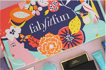
PRODUCT INSPIRATION
When figuring out how the design should be executed—whether it was a sticker on the box, a solid print, or a patterned print—these were the products picked out for inspiration. Client also took interest in my previous "Hello Robin" inspired package design project and wanted to apply similar aesthetics to their brand.


INITIAL CONCEPTS
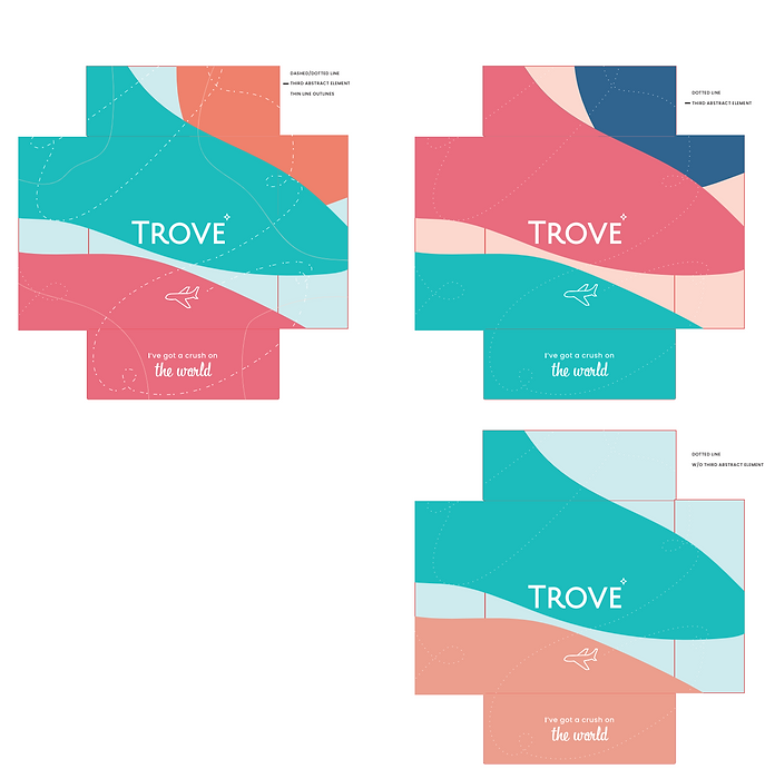
After being given several color palettes to work with, I created two concepts. For my first concept, I used organic shapes as both a design element and a representation of countries and landmarks around the globe. I included an icon of an airplane to further translate travel. This design was more whimsical and included pattern on both the interior and exterior.


For my second concept, I created a concept where we could use a sticker on top and a solid color for the exterior, along with minimal text. The TROVE sticker would act as an initial viewpoint and thus have the brand name be the main focus when customers initially receive the box. Having a contrast of patterns on the interior would support the "surprise" aspect—simple on the outside and a surprise of pattern on the inside.

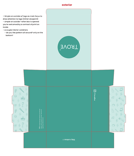
REVISED EXTERIOR CONCEPT
The client chose "concept A" with the organic shapes. They enjoyed the concept, but felt it had a "camo" look. After client review, I played more with the shapes by enlarging them and creating less cloud like shapes. This would help contrast the main text/components and the background shapes, rather than competing with them.They wanted to play with different color palettes to see if we could stray away from the green nature aspect. The design began to look more wholistic once the main components/text were centered and were not competing as much with the shapes and lines.

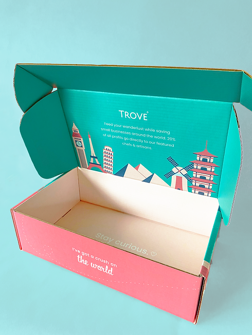
FINAL EXTERIOR

FINAL INTERIOR
After the client chose their color palette, I designed the interior. The illustrations of the landmarks were designed and placed there to evoke a "You have arrived" feeling. "Stay Curious"—another brand slogan of theirs—was placed on the bottom to be seen as the final "Thank you" after receiving all their goods.

BRAND STICKERS

Final Product